Grade 5 · Unit 9: Data representation and interpretation
Collecting and representing data
Pie charts and line graphs.
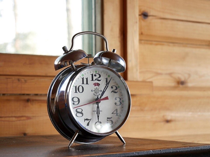
How do we spend our day?
How do you spend your 24 hours? A pie chart shows parts of a whole. The whole circle is 360°.
Pie charts
Each sector shows a fraction of the day. Sleep: 9/24 = ⅜ of the circle = 135°. Bigger sector, bigger share.
Drawing pie charts
Find the angle for one unit: 360° ÷ total. Multiply by each amount. Check the angles add to 360°.
Line graphs
A line graph joins points to show change. The trend here goes up after 2005. Use line graphs for data over time.
Spreadsheets
A spreadsheet is a database of cells in rows and columns. A formula such as =C2+B3 adds cells for you. Change one number and every total updates!
Sorting and comparing displays
Sort data into categories that help answer your question. A Venn diagram shows subsets; a bar chart compares totals; a pie chart shows parts of a whole. Compare displays: which shows the answer most clearly?
What I learnt
- I can read and draw pie charts.
- I can draw and interpret line graphs.
- I can design a questionnaire.